What Makes a Great Online Help Experience?

I recently purchased an electrical powerbar for traveling, which came with an amazing help pamphlet (really, you just plug the thing in…does it even need a pamphlet?). What amazed me was how well-thought-out and funny the pamphlet was, infused with humorous pictures and jokes – such as the suggestion to rent out spots on the powerbar while at the airport to recoup the cost of the unit – while getting a few important points across too. I read it all the way to the end – and my husband, wanting to know what was so funny, read it too!
The truth is, I’ve been thinking a lot about help documentation recently. In particular, I’ve been thinking a lot about what makes a great online help experience, since here at xMatters we’ve embarked on providing our customers with a new online help system.
There’s a huge difference in the look, content structure, and usability of online help systems. Some systems seem to be simply printed manuals that have been digitized and thrown online, while others have clearly embraced online technology to create intuitive layouts, streamline navigation, and to offer a multimedia experience.
What are some characteristics of great online help systems, and how have we incorporated these into the new xMatters Online Help?
Know your audience
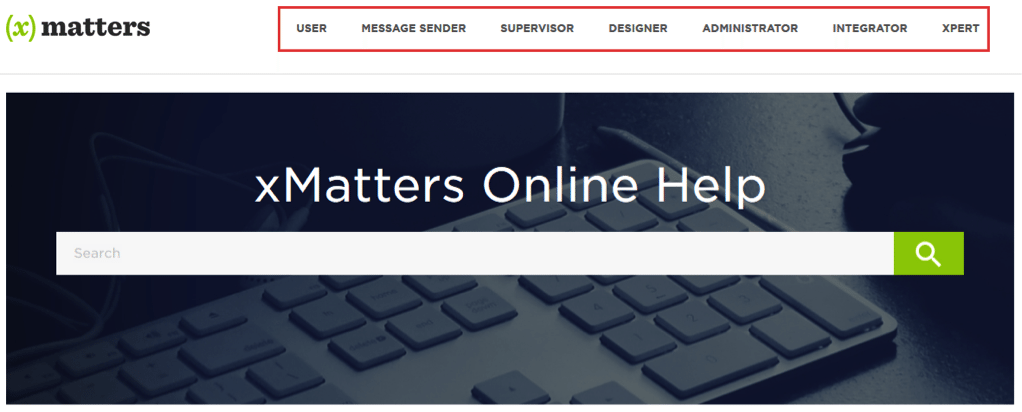
Great online help systems know their audience – who their users are, what they use the product for, and their level of technical understanding. Recognizing that xMatters has different types of users, we’ve reorganized our help content by role:

Recognizing that xMatters has different types of users, we’ve reorganized our help content by role.
Each menu contains role-relevant help topics, so customers can quickly find the information that applies to them. In some cases, we had to take a large complex topic (such as conference bridges) and create several new topics (for example, users need to know how to get on a bridge, message senders initiate and manage them, and designers build them into communication plan forms).
Ease that navigation
The internet is not a book and we don’t expect our customers to read our online help in a linear fashion like a PDF manual. There are multiple ways users can navigate topics in the xMatters Online Help, including:
- Directly linking from the product to the topic for a particular feature using context-sensitive links
- Using the search bar to locate all the help topics about a feature
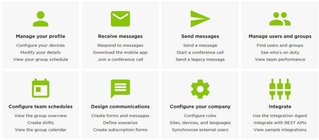
- By selecting from a set of frequently used help topics organized by theme:

Users can navigate topics in the xMatters Online Help in multiple ways.
Provide relatable examples, images, and videos
Great online help doesn’t just rely on written documentation. No matter how straightforward the instructions are, it can often be much more effective to show an example with an image or video (and some users prefer these over text). There are eLearning modules available for many xMatters features, and we’ve started to embed them directly into the online help:

We’ve started to embed eLearning modules directly into the online help.
Don’t get stale
Nobody wants to waste time on outdated help content. In fact, when you encounter what is clearly stale or inaccurate content, you immediately start to question the veracity of all of the content. Not good. When the product changes, the help should too – so, when a new xMatters feature is released, you’ll always find online documentation to go along with it.
But staying relevant isn’t only about being up-to-date. It’s also about keeping informed on how our customers use our help, and ways we can assist them to be successful. It’s an ongoing and continually evolving process which involves customer feedback, but also proactively identifying ways to improve with analytics and usability testing.
Obviously, there’s a big difference between a fun help pamphlet distributed with an easy-to-use product, and an online help system for a sophisticated product like xMatters. The bottom line is, we need to be thinking, “How can we help you?” What’s the most efficient and effective way to provide you the information you need to be successful? That’s what we’re striving for.
And hey, congratulations to whoever wrote that powerbar pamphlet – any product instructions that can get my husband and I to read them cover-to-cover is doing something right!
To read more about all the enhancements we’ve made to the online help, see the article Introducing Supercharged Online Help.
