Delivering Usability Enhancements to Wolverine

Usability is always a major theme for many features in our quarterly releases, and this release with schedule enhancements is no exception. Fittingly, we’ve named our upcoming release Wolverine as a shout-out to the coolest xPerts ever: X-Men.
Schedule
We’ve completely revamped the schedule to improve usability and to be more consistent with how on-call schedules are displayed in our mobile applications, so that now you can see at-a-glance:
- Whether you’re on call
- The groups you’re on call for
- How long you’re on call (or when you’re next on call)
Here’s what that looks like:
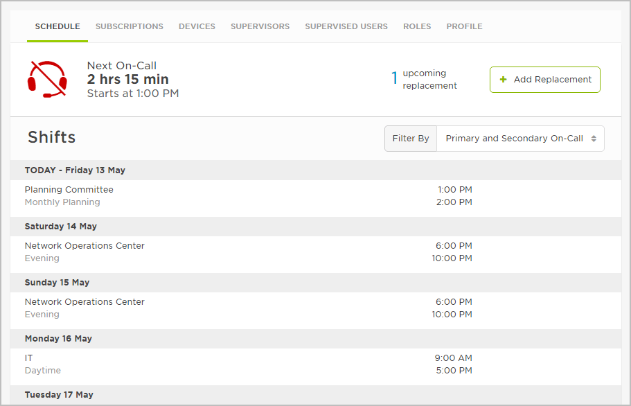
Schedule at a glance
The schedule also supports filtering based on the shifts that are most important to you (Primary On-Call, Primary and Secondary On-Call, or All Shifts):
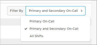
Filtering the schedule by shifts
For example, let’s say you’re part of a large 24×7 broadcast group where you don’t consider yourself to have true on-call responsibilities. Instead of displaying All Shifts, you can filter your on-call status to reflect only those groups where you’re expected to be responsive, such as Primary On-Call, or even Primary and Secondary On-Call if there’s a tight escalation (5-15 minutes).
So, now you’ll know if you should take your laptop to the grocery store, or if you’re not on-call you’ll know you can take a shower without having to take your phone with you (true customer story!).
Temporary Replacements
We wanted to allow you to view and manage elements of your schedule from a single place in the user interface, so we’ve moved temporary replacement management to the schedule tab of the new user profile.
Shifts during which you’re scheduled to replace another user will automatically appear on your schedule and indicate who you are replacing. On the flip side, your upcoming replacements (where you’ve scheduled others to replace you) are summarized at the top of the schedule. From here you can click to add a replacement, view more detailed information about your upcoming replacements, and modify or delete replacements:
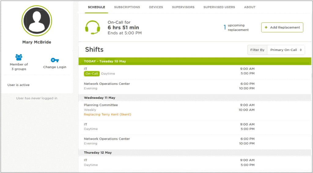
Managing temporary replacements
We’ve streamlined the list of temporary replacements to include only upcoming replacements ordered by date, making it easier to see and manage who’s filling in while you’re unavailable. Once you’ve scheduled another user to replace you for a shift it will no longer appear on your on-call schedule; the shift will only show up on the schedule of the user who’s covering the shift, so there’s no confusion about who’s on call.
Profile
The Profile tab replaces the My Details page and contains personal information that xMatters uses to identify you, such as your user ID, location, time zone, preferred language, custom fields – and now custom attributes as well.
If your company uses custom fields and custom attributes, they’ll be available in a single list under your other personal information on the profile tab, making it easier to manage your personal details from one place in the user interface:
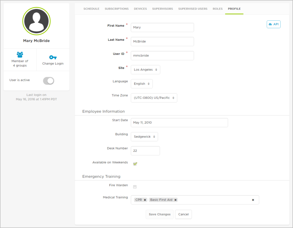
Custom fields
User profile sidebar
The new user profile design includes a sidebar with additional user detail information, such as your group membership, whether your account is active, the ability to change your login, and the last time you logged into the xMatters user interface. This new sidebar is static and visible from every tab of the user profile, so it’s always clear whether you’re looking at and managing your own profile, or the profile of another user.
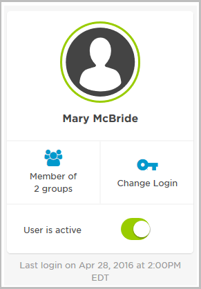
Profile summary
Group membership
You can click the group summary on the user profile sidebar for more detailed information about your group membership, including the names and description of each group you belong to.

Group membership
If you have permission to view or manage any of the listed groups, the group name will appear as as a clickable link to the group overview page:
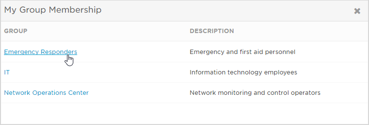
My group membership
Change Login
The Change Login button on the user profile sidebar allows you to click through to change your web and phone login information and credentials.
We’ve improved the dialog for changing your web and phone login information by dynamically displaying the password requirements for your organization:
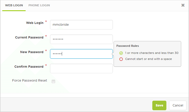
Login screen
My Schedule widget
The new My Schedule widget allows you to easily monitor your on-call status from any Communication Center dashboard. The widget displays a summary of your on-call status from your schedule. Simply drag the My Schedule widget to the dashboard and configure it using the shift filter of your choice.
The widget is a shortcut that you can use to link directly from the dashboard to the schedule tab of the user profile. When you click through, your schedule will be displayed using the filter setting that you selected on the widget:
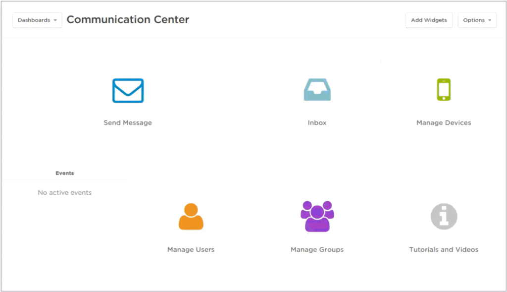
Using the My Schedule widget
Custom logo
Many customers have asked for the ability to customize the logo that’s visible in the top-left corner of the user interface after signing into xMatters – and we’re happy to deliver! Now when you set the logo for your company it will appear on both the sign-in screen and within the On-Demand interface:
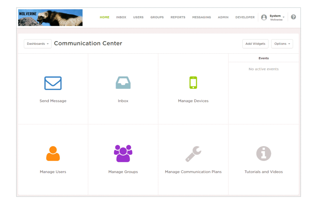
Adding a company logo
Seeing a custom logo inside the xMatters interface gives users confidence they’ve signed into a secure corporate system. Another great use for this feature is to load different logos for your non-prod and prod environments so that users have a better visual indication of which environment they’re signed into.
Join Moogsoft and xMatters for a Complimentary Webinar on Enterprise DevOps

Transform Operational Effectiveness with Enterprise DevOps
IT teams can provide real value when they collaborate to move workflows forward effectively. What if you could make every notification intelligent and actionable? Tool chains maintain agility and drive critical processes forward. Join us for a free webinar and learn how a large customer xMatters to produce automation, using the right tool at the right time to resolve issues quickly and easily.
